Jackie's Hat
I had the good fortune to visit the “Andy Warhol: 15 Minutes Eternal” exhibition at the Hong Kong Museum of Art last month, and saw his paintings of Jackie Kennedy for the first time. They are extraordinary.
No one knows how to wear a hat the way Jackie did. She always had the perfect hat to match the outfit – the right shape, the right color, the right angle. Her hats were a statement seamlessly integrated into her overall ensemble. The perfect touch.
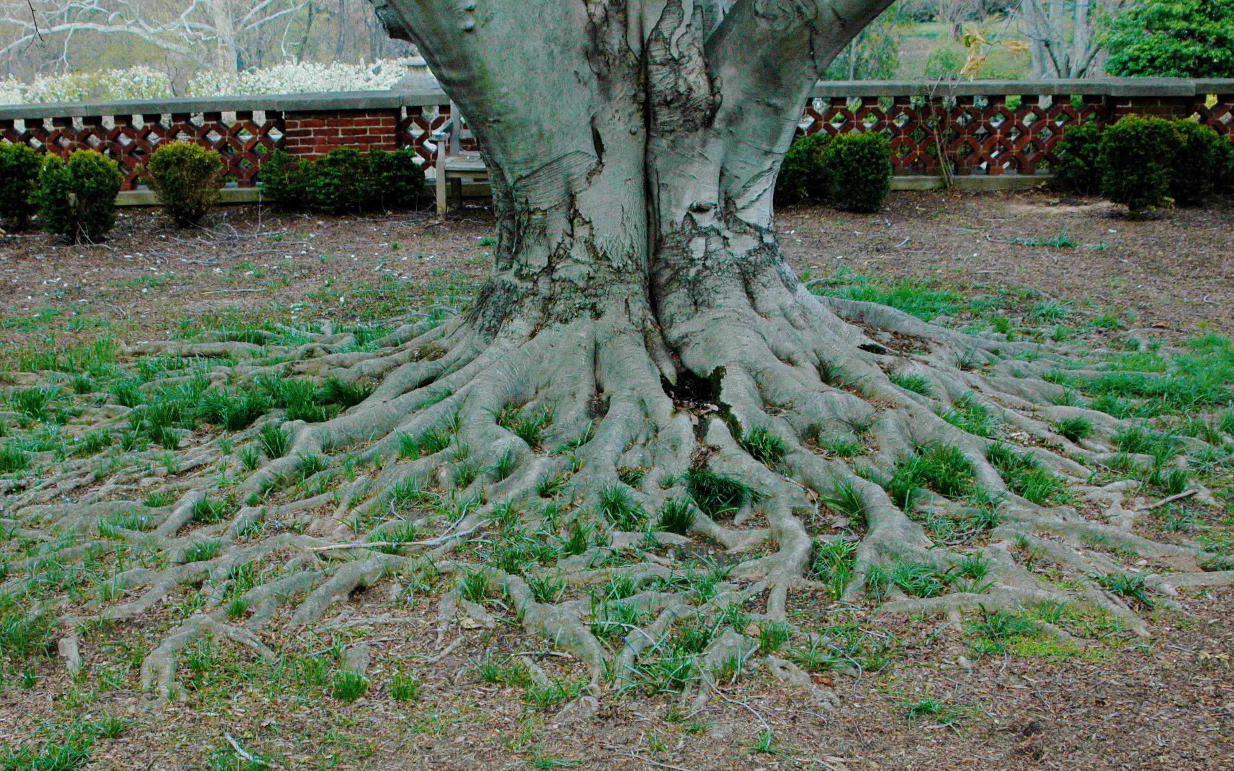
About the same time I went to see the Warhols, a former client in New York had a question about her garden, which is dominated the single most gorgeous copper beech I have ever seen. It seems she’d replaced two large perennial beds with lawn, and there was one small remaining flowerbed that she wanted to know what to do with.
My advice was to plant the bed and the remaining plantings to relate to the copper beech instead of making it the stand-alone focal point she’d been considering. It is much too small, there in the shadow of this enormous tree, and I thought it would look odd planted differently from the rest of her garden. Her copper beech (Fagus sylvatica), with its dark coppery red leaves, sets the stage for the garden, especially with respect to color and mass, and there is no way a small bed can compete with it.
A word to the wise: Before you run out and buy a copper beach, be aware that copper beeches are magnificent but hardly appropriate for small urban gardens, since they can grow to up to 75 feet tall with a 60 foot crown and trunks 3 feet or more in diameter. I do not recommend them for your Georgetown garden unless ALL you eventually want to look at is a strong, smooth silvery trunk with matching surface roots –a sculpture on its own. Think of the beech terrace at Dumbarton (a different species, but same effect). If you are hankering for a good red color, try a Japanese maple (Acer palmatum). It will be better proportioned for a small space, and has fabulous reliable color in summer, glorious orange leaves in fall, and handsome blackish bark in winter.
The point here is that your garden should be composed of elements that, when combined, make a unified statement that is easy to look at and easy to be in. A well designed garden is made up of components, some major and some minor, almost like accessories, that should combine to form a pleasing whole and to reflect the home owner’s style. You wouldn’t expect Jackie to glide into a room wearing a Chanel suit and a Red Sox cap, would you? Too incongruous and not her style.
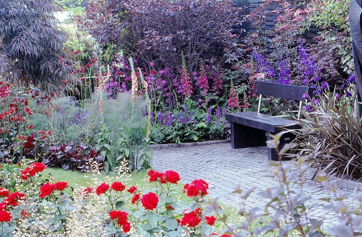
Say you wanted to do a garden that picked up on the reddish leaves of the Japanese maple you have just installed on my recommendation. There was such a garden at the Chelsea Garden show some years ago. Anchored by gray flagstone and a black bench, the garden was planted with complementary dark purple/reddish leafed shrubs, grasses, and plants and then set off with silvers, blues, and pinks. Bright red roses added a needed punch, a perfect composition.
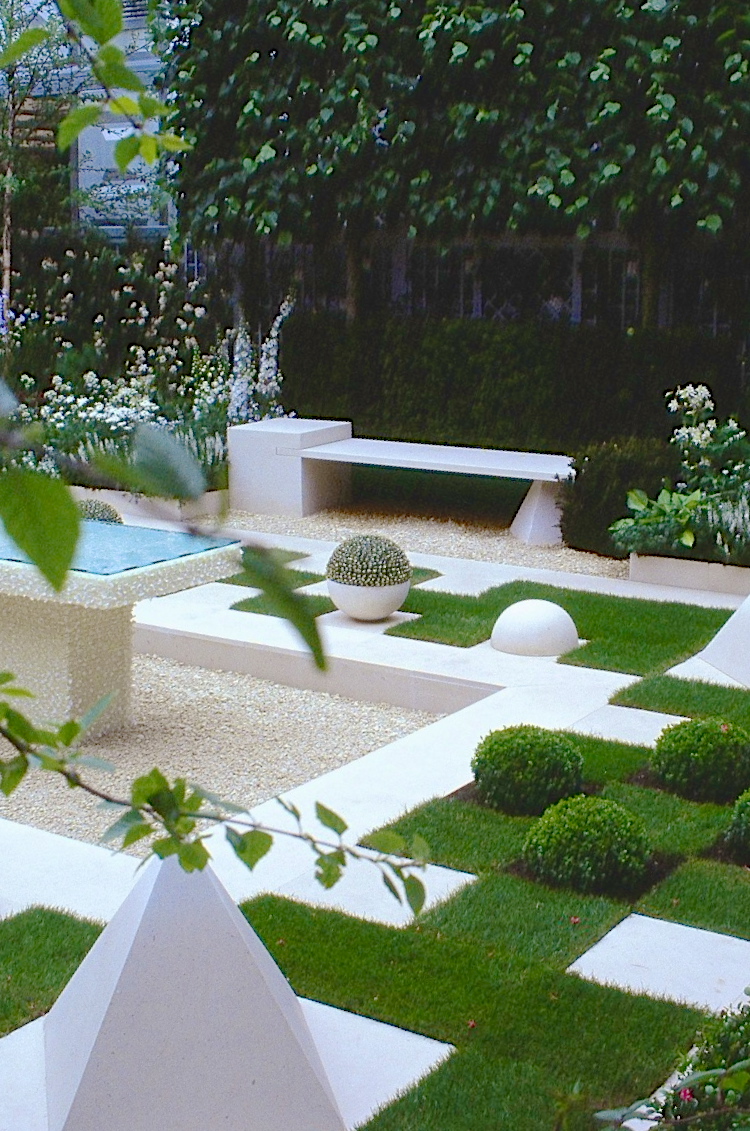
Suppose you decided this was all too dark, and you wanted to do a very stylized garden, all in white and green, like another Chelsea garden. You could use all- white hardscape, white gravel, white bowls and details, set off with the greens of grass, tree leaves, and white and green flowers. The Chelsea green and white garden was pretty perfect. Each detail was thought through and related to the rest of the garden. The table in the center gave the garden a strong focal point. A word of caution: This is the one and only acceptable use of white gravel.
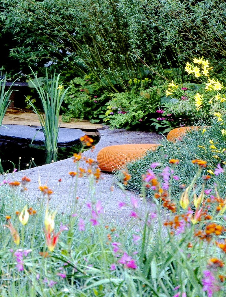
If you are in love with yellow and orange flowers, you might choose hardscape colored to set them off – a blue gray works well. A third Chelsea garden did just that and was outfitted with bright orange seating poofs to reinforce the color theme. The curve of the water feature pick up the curves of the poofs, so it wasn’t just the color scheme but the flowing lines that worked together well. The garden was informal and so the texture of the plantings softened the hardscape. One could imagine sitting there, listening to the sound of water and the breeze rustling in the leaves and canes of the bamboo. I confess, it is hard to imagine getting relaxed on those poofs. I would long for a chaise.
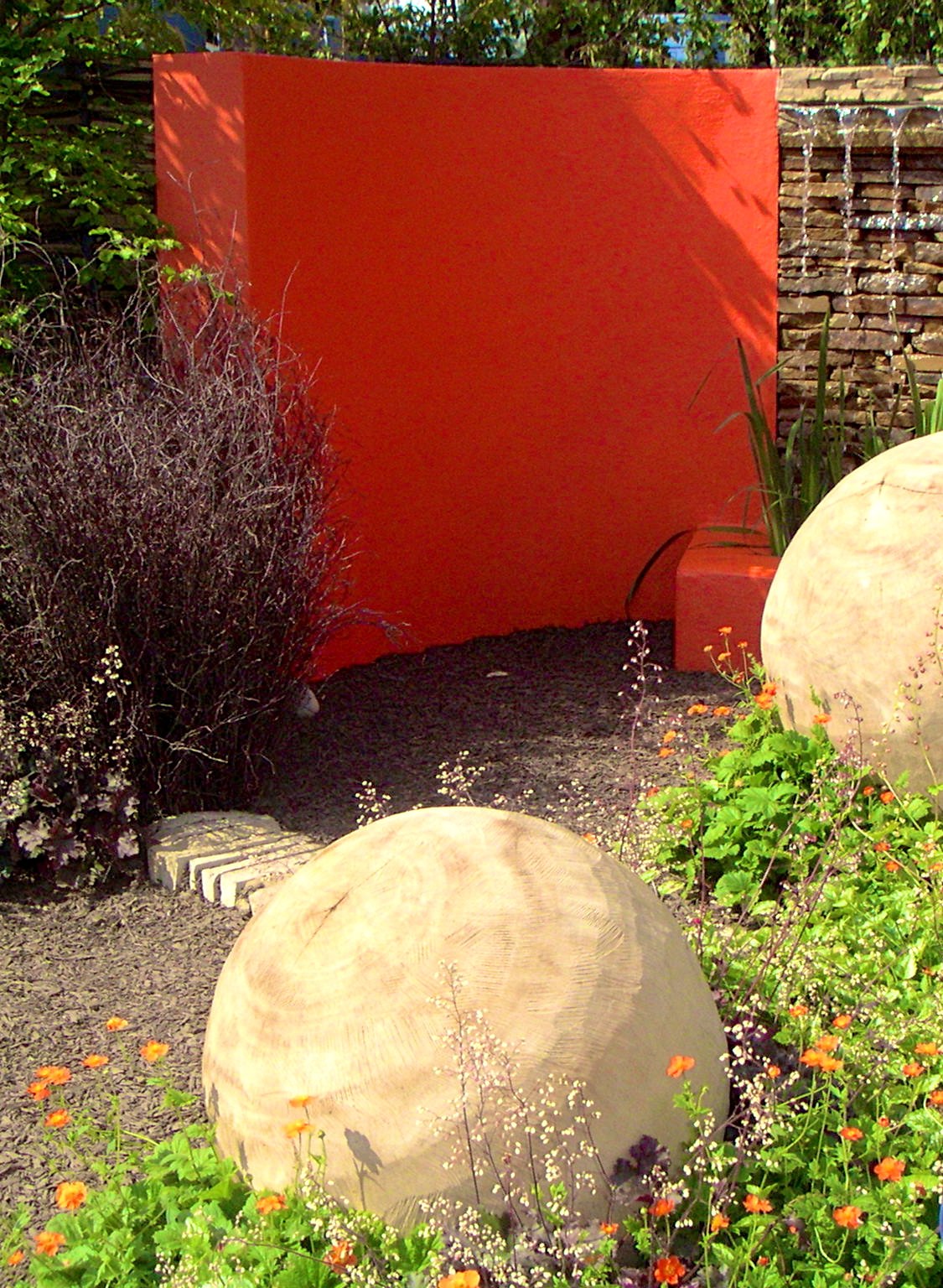
If you had an unattractive wall in your garden, you might take a page from a fourth Chelsea garden whose designer chose a bright tangerine color, and proceeded to soften it with plantings of dark burgundy red leaves and small orange and white flowers. Gold-beige wooden spheres added balance to the pizzazz of the painted wall. My only complaint about this display was that the paths were mulched – beige gravel would have been just right both for color and for the sound it makes when walked on. You might recoil at the idea of painting a wall such a crazy bright color and you would be right to do so if you were not up to completing the statement. In this garden it worked because it was only one element of the overall ensemble. Sort of like Jackie’s hat.
This year the Chelsea Garden Show will be celebrating its centenary -- May 21-25th.


